
In logos too!!!
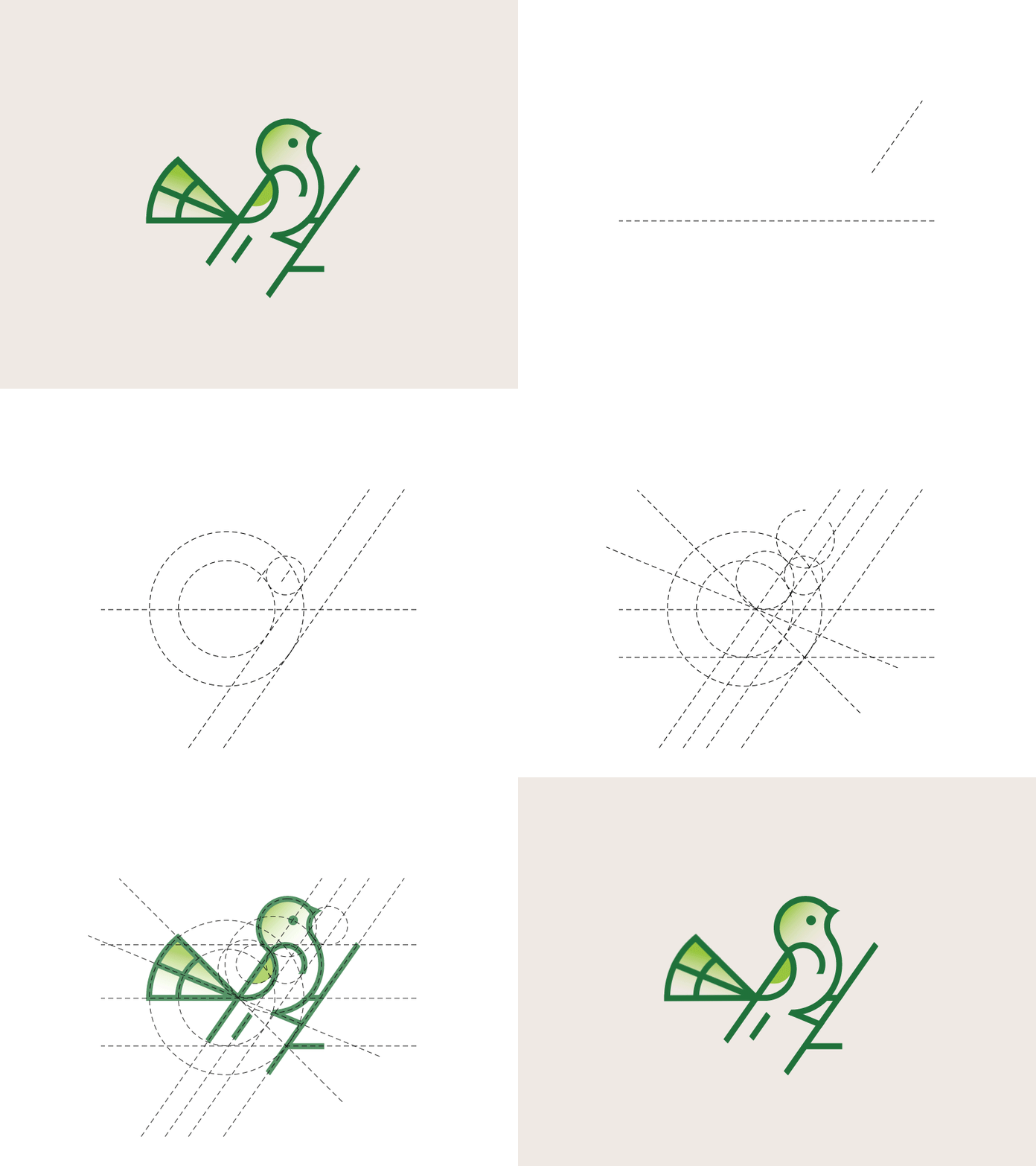
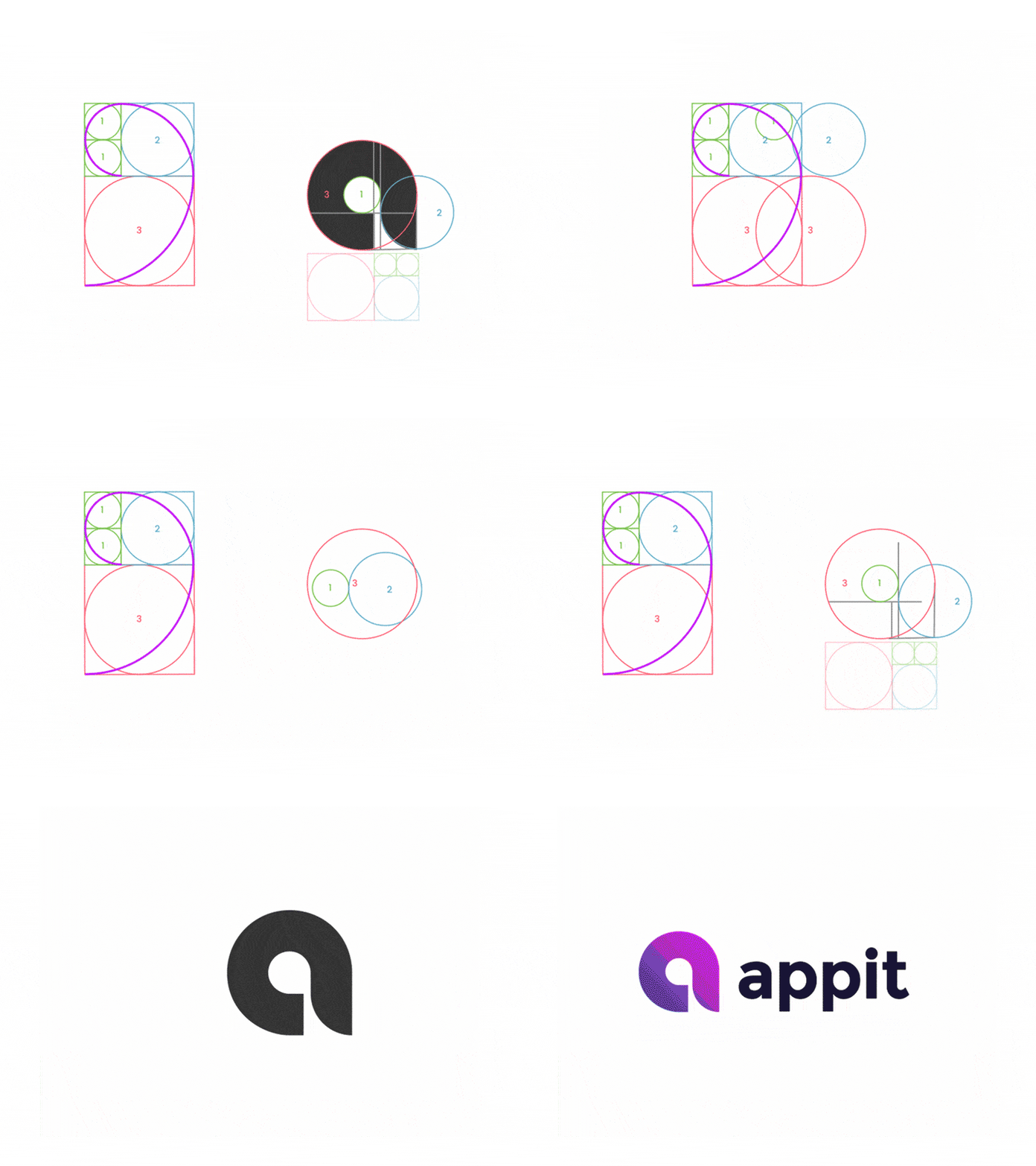
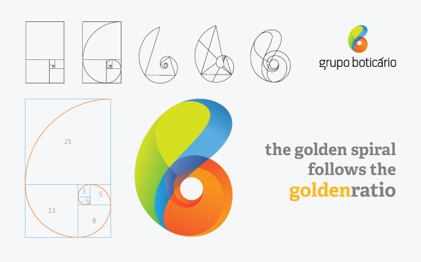
A well-conceived logo is vital to your brand so people can understand your core message at almost a single glance. That’s why it’s a great idea to consider the Golden Ratio when designing a logo to instantly draw people in and help them connect. In fact, many of the biggest brands in the world use the Golden Ratio to form their logos: Pepsi, Apple and Twitter to name just a few. For example, Green in Blue’s logo for baking business ‘The Hungry Gnome’ is a perfectly balanced contemporary-kitsch logo that uses the Golden Ratio to guide image placement, and the sizing of its text.Rahajoe’s logo for Little Spoon uses circles within the Golden Ratio as a grid to guide their design. When designing a logo, you can even imagine the Fibonacci sequence as a series of circles, then rearrange them to form a grid as the foundation for your logo design. This is the basis of many logos, including the Twitter bird. Using these proportions in your design work will take time and practice. But the more you use it, the more you will start to see relationships between elements of your design and begin to spot and correct areas that are inconsistent in your work and just don’t feel right. The Golden Ratio is the relationship between two quantities where the ratio of the small quantity (a) to the large quantity (b) is the same as the ratio of the large (b) to the whole (a+b).
Some of the simplest ways to use Golden ratio in your own logo :
- Take all the main shapes from the Golden Ratio so that the proportions will be harmonious.
- Combine the shapes and used a grid to align all parts.
- Finally, refine the points, shapes, and connections.
- Another way to use the Golden Ratio is to determine the height and width of the logo as well as the proportions of the strokes.
- Lastly, you can use the Golden Ratio to help me decide the placement, size, and length of key elements in a logo.