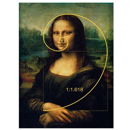

Art and design is infamously subjective. One person’s trash can be another’s masterpiece. But luckily there is an age-old number that can help aid your designs into scientifically-proven beauty: the Golden Ratio.Have you ever secretly wondered, ‘What’s so great about the Mona Lisa?’ The answer is the Golden Ratio.Otherwise known as The Golden Section, Golden Mean, or the Greek letter ‘phi’, the Golden Ratio is a very handy number that helps you create beautiful, perfectly balanced designs that are aesthetically satisfying on a deep cerebral level. Cool, huh?Although art and design are often led by instinct and creativity, the Golden Ratio uses mathematics to transform your image-making, layout, typography and much more. So let’s get into it.
Don’t let a few equations scare you off! The Golden Ratio is actually a lot simpler than it looks. And it’s found everywhere. The Golden Spiral appears in nature all around us. From hurricanes to flowers, galaxies to shells… and even those weird mutant cauliflowers you get at the grocery store sometimes.
Typography hierarchy
When creating any design that uses text, always consider messaging hierarchy in your layout. Whether it’s a poster, a wedding invitation or a website layout, you can use the Golden Ratio to guide your typography sizes.
Image composition
When considering the harmony of your images, it’s always good to stop, take a step back and come back with a fresh eye. But if you don’t have the time to ponder your works of art, a quicker alternative is the Golden Spiral. Overlay the spiral on your images to see which elements sit where, and if they really do create harmony.
Logo design
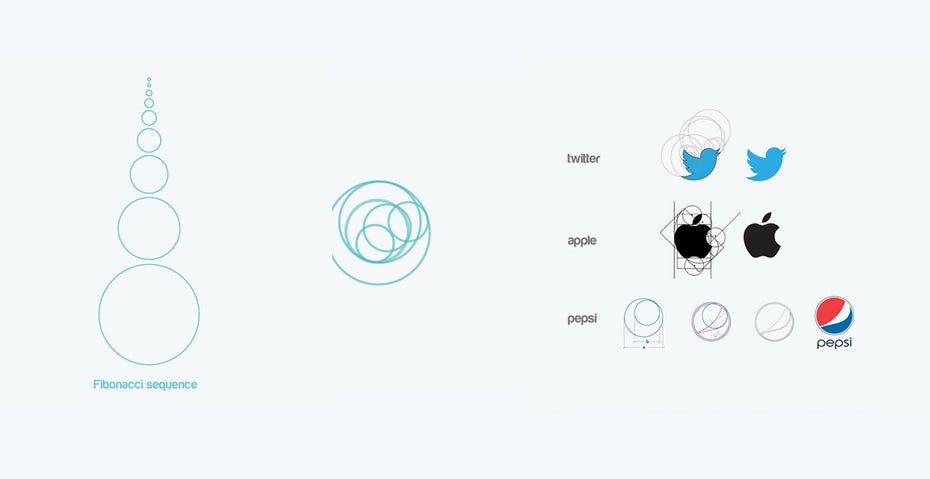
A well-conceived logo is vital to your brand so people can understand your core message at almost a single glance. That’s why it’s a great idea to consider the Golden Ratio when designing a logo to instantly draw people in and help them connect. In fact, many of the biggest brands in the world use the Golden Ratio to form their logos: Pepsi, Apple and Twitter to name just a few.